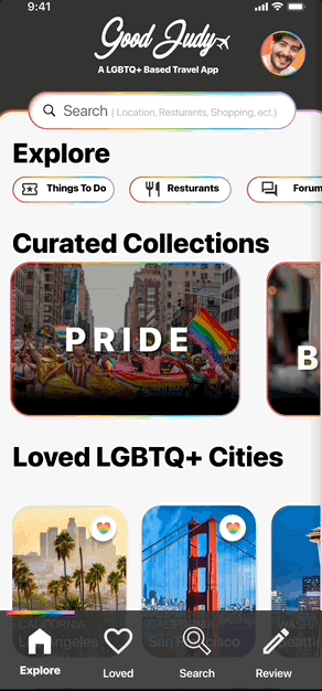
Good Judy.
A LGBTQ+ TRAVEL APP
THE CHALLENGE: Create a user-centered platform that provides essential travel resources while prioritizing safety and inclusivity for the LGBTQ+
THE SOLUTION: Empowered travelers with tailored information, fostering more enjoyable and worry-free experiences.
ROLE: UX Researcher. UX Designer. UI Designer.
TOOLS: Figma, Photoshop, and Google Workspace
DURATION: 2 Weeks.


[ THE PROBLEM ]


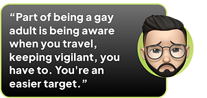
Everyone loves to travel and make new experiences and the LGBTQ+ Community loves to do just that! However, According to the FBI Hate crimes against LGBTQ+ people have been on a rise over the past three years.
[ DISCOVER ]
[GENERAL RESEARCH]
Empathy comes first! I started by gathering some general facts on LGBTQ+ Crime.

HATE CRIMES
ACCORDING TO THE SEATTLE POLICE DEPARTMENT LGBTQ+ PEOPLE ARE THE MOST LIKELY TO BE TARGETS OF HATE CRIMES.

GAY MEN
ACCORDING TO THE FBI GAY MEN ARE MORE FREQUENTLY TARGETED IN HATE CRIMES ACROSS THE USA.

INJUSTICE
ACCORDING TO THE BBC UK POLICE FORCE FEWER LGBTQ+ HATE CRIMES ARE BEING SOLVED EVERY YEAR
[SURVEY]
I put out a survey just to capture some quick data of potential users. Safety was rated very important when on a trip.


[COMPETITOR ANALYSIS]
To understand what already exist in the market and do some initial brainstorming. I took a look at some competitors.


[ PRO ] : A trustworthy travel companion that will help make the most of your experience
[ CON ] : Lacks community and cant book anything online.
[ PRO ] : Search over 1 million listings from private rooms to LGBTQ-friendly hotels.
[ CON ] : Caters to Cis-Gendered Gay Men and not the entire LGBTQ+ Community


[ PRO ] : Free cancellation on most hotels. Book Hotels, Car, Flights, Activities.
[ CON ] : Vacation packages makes you go to mobile website
[1:1 USER RESEARCH]
I developed a research interview plan and got great insights.
Users were all apart of the LGBTQ+ Community.


[ DEFINE ]
[USER INSIGHTS ]
To Synthesize the research gathered I developed: User Insight Board, Affinity Diagram , User Persona, & Empathy Map.


[PROBLEM STATEMENT]
"How might we build a travel platform that better serves the LGBTQ+ community and locate safer places for them to travel to? "
[ DEVELOP ]
[IDEATION]
I brainstormed a few features for the app based on the research I had done. Myself and 2 other colleagues voted for top features. I mapped the top 3 into a priority matrix.


[BRAINSTORMING]
I knew with safety being the main concern it was essential to create a product with an online community. I also thought of the inspiration I gathered for this project to come up with a solution for my users.


[INITIAL USER FLOW]
As I was initially Brainstorming I developed an On-Boarding User Flow. I knew I wanted to include an interest section to help give recommendations based on users likes to help create an online Community.

[WIREFRAME SKETCHES]
The first round consisted of low fidelity sketches of my Onboarding


[LO-FI PROTOTYPE]
I converted my sketches into a lo-fi prototype so I could begin usability testing.


[ USABILITY TESTING ]
I tested the Lo-Fi prototype with 5 users and identified some areas for improvement.
[PROFILE]
[ PROBLEM ]
Users recommended putting a birthday to confirm age and felt the input fields were too close together.

[ SOLUTION ]
I changed the design to have more space for the input fields and Also added a Birthdate field.

[HOME PAGE]
[ PROBLEM ]
Initial Design had a hamburger menu which some users were unsure what the icon did. Users said it was too confusing to get back to the home page.

[ SOLUTION ]
I created a navigation bar on the bottom to make it easier to get to the home page as well as other app page locations. I also added labels underneath the icons for added clarity.

[CITY PAGE]
[ PROBLEM ]
Users felt card was too small wanted a bigger image. Also the opportunity to save as a "Loved" location was not available.

[ SOLUTION ]
I changed the card design to include a heart to save "loved" places. I was also able to add neighborhood information for added clarity for the user.

[RESTURANT]
[ PROBLEM ]
Users were unsure what the icons did was really confused with the icon on the far right.

[ SOLUTION ]
I changed the design to have labels underneath the logo. I also added a search bar for the restaurant for users to easily find information.

[PATIENT BUTTON]
[ PROBLEM ]
Users wanted a function to be able to add the reservation to their phones calendar and it was unclear if they clicked the date if it would allow them to save the date.

[ SOLUTION ]
I added an "Add to Calendar" button for users to easily save to their favorite calendar app.

[ DELIVER ]
[HI-FI PROTOTYPE]
A Hi-Fi prototype was created to test my ideas and validate the design. It was extremely helpful for me to test users on the tasks that I focused on to gain realistic insights, also understand what worked well and what requires further improvement.

[FINAL THOUGHTS]
After two weeks of user research, analysis and design, I was able to validate the changes I had made. I did this by testing my clickable prototype with 5 new users.With More Time, my future plans include:
-
Focusing on making a map to easily find recommended LGBT+ Safe places.LGBT Resources such as free clinics.
-
Researching further into adding more features into the app. Especially when it comes to building an online community.
-
Fix animations throughout the app to make more seamless and matching