French Bulldog Resuce Network.
A WEBSITE REDESIGN
THE CHALLENGE: Redesign a non-profit organization website. Using data from user-centered research and insight from the stakeholder to create the best possible result.
THE SOLUTION: Redesign the website that focuses on the stakeholder's main concerns, as well as making the content on the site legible, to make it a user-friendly experience.
ROLE: UX Researcher. UX Designer. UI Designer.
TOOLS: Figma, Photoshop, and Google Workspace
DURATION: 2 Weeks.

[ The Process. ]
[01] Identify.
-
Non-Profit Website
-
General Research
-
Redline Analysis
-
Competitor Analysis
[02] Research.
-
Research Plan
-
User Interviews
-
Surveys
-
Affinity Diagram
-
User Persona
-
User Journey
-
Problem Statement
[03] Ideate.
-
I Wish Board & Priotity Matrix
-
User Task Flow
-
Initial Sketches
[04] Prototype.
-
LoFi Wireframe
-
Styleguide
-
Iterations
-
Clickable Prototype
[05] Validate.
-
Validate
-
Final Thoughts
[01] Identify.
NON-PROFIT WEBSITE
For this challenge I chose to redesign the French Bulldog Rescue Network [FBRN] as it clearly lacked modern design and was in need of a facelift. I personally own a Frenchie so this was a project I was very passionate about. (Note: website currently got a new update)
To Access FBRN

GENERAL RESEARCH
I started my research by looking up various pet rescues and facts about pet adoption to help gain empathy and understanding of the issue I want to help solve.

20%
PETS ADOPTED
164 MILLION PETS ARE OWNED IN THE USA. ONLY 20% OF THOSE ARE ADOPTED.
8 SECONDS
EVERY 8 SECONDS AN ANIMAL IS EUTHANIZED IN THE USA.

60%
DOGS EUTHANIZED
OF ALL ANIMALS THAT ARE EUTHANIZED IN THE USA 60% ARE DOGS.
REDLINE ANALYSIS
To understand the formatting of the current website and discover what was important enough to be displayed. I performed a redline Annotation on the original website.
-
Users could do four things:
ADOPT
DONATE
SHOP
VOLUNTEER

-
The site was considerate of Covid-19 and had a banner on the very top. There were duplicates.
-
Navigation bar failed the Color Accessibility.
-
In terms of responsive web design, the navigation bar would stack.
-
The placement of images were out of place. Text would wrap around the images.
-
CTA buttons were hard to detect.
HIGHLIGHTS:
COMPETITOR ANALYSIS
To better understand and develop interview questions I used the SWOT Method [Strength, Weaknesses, Opportunities, Threat Method ] as means to perform competitor analysis. I compared the following 3 Companies that were based around finding a pet


[ PRO ] : Their Donate button is everywhere and is a noticeable color.
[ CON ] : Long wait times for support.
[ PRO ] : Card design and information display
[ CON ] : Search bar is not easily displayed
[ PRO ] : Lots of helpful information for Bulldog potential owners.
[ CON ] :
Has multiple links to an empty page.
[02] Research.
RESEARCH PLAN.
For our user interviews, we decided to focus on current pet owners (bought or adopt).
1:1 Via Zoom
RESEARCH METHOD
5 USERS
PET OWNERS
24
SURVEY RESPONSES
The goal of the user interviews was to understand:
[01] Recognizing the user's preference in pet features.
[02] Understanding what the user's thought process were when adopting a pet.
[03] Knowing the prerequisites for donating to certain non profits.
[04] Asking the user's opinion and observing their reaction on the current FBRN Website.
USER INTERVIEWS.


“I have a Frenchie, I found him on Craigslist.”
“The pets health is most important for me .”


“When I am looking for a pet I am interested in their personality.”

“Adoption process is too much work.”
SURVEYS
During the interview phase I sent out a survey to random pet owners to collect some quantitive data below are a few results:

38%
ADOPTED PETS
38% OF OUR SURVEY USERS REPORTED GETTING THEIR PETS THROUGH PET ADOPTION.
PERSONALITY& HEALTH
SURVEY USERS CONSIDERED PERSONALITY AND HEALTH AS TOP FEATURE.

100%
WOULD ADOPT
100 % OF SURVEY USERS SAID THEY WOULD CONSIDER ADOPTING A PET.
AFFINITY DIAGRAM
The findings from the user insights research were then organized on an affinity diagram to better understand their relationship to each other and to determine priorities moving forward in the process.
USER JOURNEY.
To help communicate information about user experience i developed a User Journey Map.


USER PERSONA.
To help communicate information about users that I collected during research, I created a User persona. Accompanied with a Storyboard and Empathy Map.


PROBLEM STATEMENT
"How might we provide a health and personality description about the dog as well as provide multiple pictures . Doing this will allow our website to show users more aspects about their potential future pet. Also How might we help meet the needs of the stakeholder gain donations. "
[03] Ideate.
I WISH BOARD & PRIORITY MATRIX
I interpreted the diagram into a "I wish" board and feature priority matrix. I also generated a user flow to understand the process of the user.


USER TASK FLOW.
I created task flows for steps a user typically goes through in order to complete the following 4 Task
[01] Adoptable Dogs
[02] Donate to FBRN.
[03] Adoption Application.

INITIAL SKETCHES.
Gathering what information I had I began to give a rough sketch of what a Lo-Fi version could potentially look like.

[04] Prototype.
LO-FI WIRE FRAMES
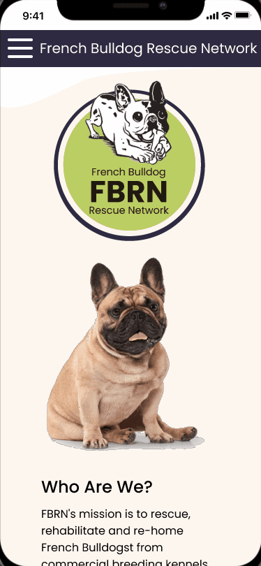
During the process of creating Lo-Fi Wireframes, I focused on a Responsive Web design to ensure the website could be viewed on any device.

STYLEGUIDE
After I came to a good place on my Lo-Fi prototype my next step was to establish a style guide to apply to my lo-fi wireframes as I was performing usability testing throughout the project.

ITERATATIONS
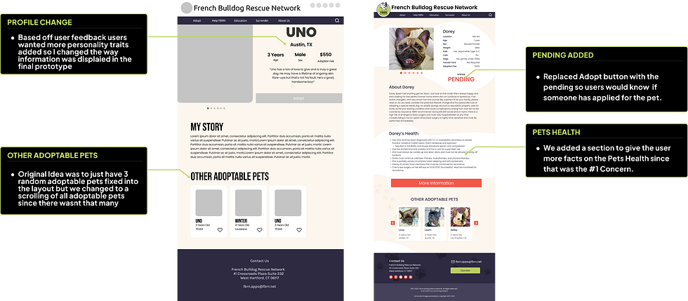
Moving forward with the process, I turned my Lo-Fi sketches into Hi-Fi prototypes. Below are the screen comparisons showing before and after usability testing side by side. I focused on the following 4 Pages
LANDING
PAGE
DONATE
ADOPTABLE
PETS
ADOPTION
APPLICATION
LANDING PAGE ITERATION.

DONATE
ITERATION.

ADOPTABLE ITERATION.

PET PROFILE
ITERATION
ADOPTION APPLICATION
ITERATION

CLICKABLE PROTOTYPE.
I created a responsive web design to test my ideas and validate the design. It was extremely helpful for me to test users on the tasks of Looking for a pet to Adopt, Apply For a Pet, and Donate. I tested with users to understand what worked well and what requires further improvement.


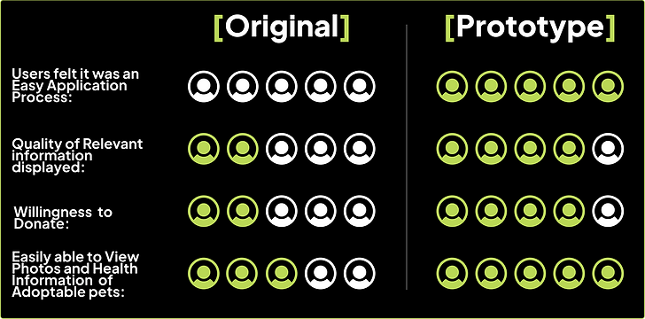
[05] Validate.
After two weeks of user research, analysis and design, I was able to validate the changes I had made. I did this by testing the original website and my clickable prototype with 5 users. The results are:
[ Final Thoughts]
Some of the thing I Learned....
-
The importance of adding a progress bar especially when it comes to forms.
-
How to leverage colors to solve multiple problems related to the UX experience such as branding, feelings, & hierarchy.
-
How to organize a lot of information in digestible pieces for the user to understand.
Like what you see? Contact Me.
